
Introduction
In Agile software development, tracking progress is as important as writing clean code. Teams need visibility into how much work remains, how much has been completed, and whether scope changes are impacting delivery. This is where Agile progress charts come in most notably burndown and burnup charts.
For developers, Scrum Masters, and engineering managers, understanding the difference between a burn down chart vs burn up chart is critical. While both charts visualize progress over time, they answer very different questions and are built on different assumptions.
This blog explains burndown vs burnup charts, how they work in Agile projects, when to use each, and how developers can generate them programmatically using Jira data.
What Are Burndown and Burnup Charts in Agile?
In Agile and Scrum, progress tracking must be simple, visual, and transparent. Burndown and burnup charts help teams answer key questions:
- Are we on track to complete the sprint?
- How fast is work being completed?
- Is scope changing mid-sprint?
A burndown chart focuses on remaining work, while a burnup chart focuses on completed work and total scope. The debate around burnup vs burndown exists because each chart highlights different aspects of delivery.
Both charts are commonly generated automatically by tools like Jira, but many teams also build custom dashboards using Jira APIs.
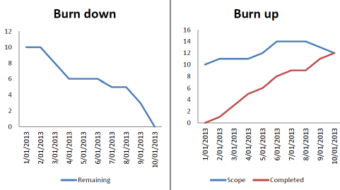
Understanding the Agile Burndown Chart
A burndown chart shows how much work is left to do in a sprint.
Chart Structure
- X-axis: Time (days in a sprint)
- Y-axis: Remaining work (story points or hours)
The line starts at the total estimated work and ideally slopes downward to zero by the sprint end.
Developer Perspective
Burndown charts are popular because they are:
- Easy to read
- Ideal for fixed-scope sprints
- Useful during daily stand-ups
However, burndown charts do not clearly show scope changes, which can cause confusion an important limitation when comparing burndown vs burnup.
Understanding the Agile Burnup Chart
A burnup chart takes a more transparent approach by separating progress from scope.
Chart Structure
- X-axis: Time
- Y-axis: Work units (story points)
- Two lines:
- Completed work
- Total scope
- Completed work
If scope increases, the scope line moves upward while completed work continues to rise independently.
For software teams dealing with changing requirements, this makes burnup vs burndown comparisons much clearer.
Burndown vs Burnup Chart: Core Differences Explained
| Aspect | Burndown Chart | Burnup Chart |
| Measures | Remaining work | Completed work |
| Scope visibility | Implicit | Explicit |
| Best use case | Fixed sprints | Evolving scope |
| Stakeholder clarity | Moderate | High |
From a coding and reporting standpoint, the burndown vs burnup charts difference lies in how data is calculated – subtraction vs accumulation
You Might Also Like:
Your Guide to Story Points & Estimation
A Comprehensive Guide to Setting Up Agile Teams
Everything You Need to Know About the Agile Certification Process
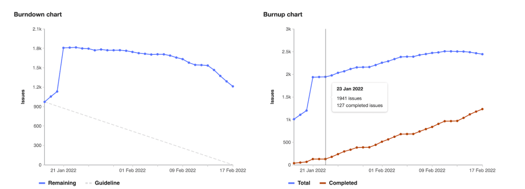
Using Jira Data to Build Burndown and Burnup Charts
Below is a realistic Jira-based example showing how developers can generate these charts programmatically.
Fetch Sprint Issues from Jira
import requests
from requests.auth import HTTPBasicAuth
JIRA_DOMAIN = “your-domain.atlassian.net”
EMAIL = “your-email”
API_TOKEN = “your-api-token”
SPRINT_ID = 123
url = f”https://{JIRA_DOMAIN}/rest/agile/1.0/sprint/{SPRINT_ID}/issue”
auth = HTTPBasicAuth(EMAIL, API_TOKEN)
response = requests.get(url, auth=auth)
issues = response.json()[“issues”]
This returns all sprint issues along with status, story points, created date, and resolution date.
Burndown Chart Calculation (Remaining Work)
Burndown logic subtracts completed work from the total.
from datetime import datetime, timedelta
TOTAL_POINTS = sum(
issue[“fields”].get(“customfield_10016”, 0) for issue in issues
)
sprint_start = datetime(2025, 3, 1)
sprint_days = 10
remaining = []
current_remaining = TOTAL_POINTS
for day in range(sprint_days):
date = sprint_start + timedelta(days=day)
for issue in issues:
resolved = issue[“fields”].get(“resolutiondate”)
points = issue[“fields”].get(“customfield_10016”, 0)
if resolved:
resolved_date = datetime.strptime(resolved[:10], “%Y-%m-%d”)
if resolved_date.date() == date.date():
current_remaining -= points
remaining.append(current_remaining)
What This Shows
- A downward trend means work is being completed
- Flat lines indicate blockers or delays
This approach reflects how burndown vs burnup differs technically — burndown focuses on what’s left.
Burnup Chart Calculation (Completed Work + Scope)
Burnup charts accumulate completed work and track scope separately.
Completed Work
completed = []
current_completed = 0
for day in range(sprint_days):
date = sprint_start + timedelta(days=day)
for issue in issues:
resolved = issue[“fields”].get(“resolutiondate”)
points = issue[“fields”].get(“customfield_10016”, 0)
if resolved:
resolved_date = datetime.strptime(resolved[:10], “%Y-%m-%d”)
if resolved_date.date() == date.date():
current_completed += points
completed.append(current_completed)
Scope Tracking
scope = []
for day in range(sprint_days):
date = sprint_start + timedelta(days=day)
daily_scope = 0
for issue in issues:
created = issue[“fields”][“created”]
created_date = datetime.strptime(created[:10], “%Y-%m-%d”)
points = issue[“fields”].get(“customfield_10016”, 0)
if created_date.date() <= date.date():
daily_scope += points
scope.append(daily_scope)
This is why teams often prefer burnup vs burndown scope changes are visible instead of hidden.
Visualizing Burndown vs Burnup Charts
import matplotlib.pyplot as plt
# Burndown
plt.plot(remaining)
plt.title(“Sprint Burndown Chart”)
plt.xlabel(“Sprint Day”)
plt.ylabel(“Remaining Story Points”)
plt.show()
# Burnup
plt.plot(completed, label=”Completed Work”)
plt.plot(scope, label=”Total Scope”)
plt.title(“Sprint Burnup Chart”)
plt.xlabel(“Sprint Day”)
plt.ylabel(“Story Points”)
plt.legend()
plt.show()
Advantages of Using a Burndown Chart
- Simple and intuitive
- Ideal for fixed sprint goals
- Helps teams detect execution issues early
In many cases, burndown vs burnup decisions favor burndown for short, predictable sprints.
Advantages of Using a Burnup Chart
- Makes scope changes visible
- Improves stakeholder communication
- Better for release and roadmap tracking
This transparency is why burn up vs burn down chart comparisons often lean toward burnup for complex projects.
When to Use Burndown vs Burnup Charts in Scrum Projects
Use Burndown When:
- Sprint scope is locked
- Team velocity is stable
- You want quick execution feedback
Use Burnup When:
- Scope evolves frequently
- You’re tracking epics or releases
- Stakeholder clarity is critical
Many Agile teams successfully use both, eliminating the need to choose strictly between burndown vs burnup charts.
Common Mistakes Teams Make with Burndown and Burnup Charts
- Treating charts as performance metrics
- Ignoring scope changes in burndown charts
- Overcomplicating burnup charts
- Updating data inconsistently
Misuse often leads to incorrect conclusions in burndown vs burnup analysis.
Best Practices for Tracking Progress in Agile Using Charts
- Update data daily
- Use consistent estimation units
- Pair charts with sprint goals
- Use charts to spark discussion, not blame
Key Takeaways: Choosing Between Burndown and Burnup for Your Team
There’s no universal winner in the burndown vs burnup charts debate.
- Burndown charts focus on execution
- Burnup charts focus on transparency
- Together, they provide a complete picture of Agile progress
For modern software teams, burnup vs burndown is not an either-or decision. It is about using the right chart at the right time.